


This isn’t exactly something I’m aiming to make a habit out of, in terms of reviewing the comics, but I wanted to check out this new ‘reboot’ of the G.I. Joe comics and figured I’d share some thoughts.
I was big into the comics as a kid. They very much shaped my love for G.I. Joe and the characters. I was a big fan of the reboot a few years ago, too. The biggest standout was the Chuckles storyline.
Amazing.
As the comics got a little too colorful and strayed away from the grounded military thread, I drifted off from reading them. Guessing others did, too.
But IDW (and Hasbro, quite honestly) have been making quite a thing out to this ‘one universe’ concept and their Revolution storyline (the precursor to some elaborate film franchise they’re hoping for, I understand). G.I. Joe, Transformers, a few others, they all share this one universe now.
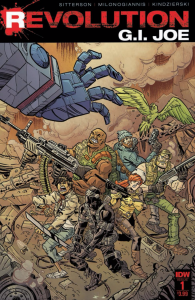
I may or may not keep reading the new Joe comics, not 100% on that yet, but I will admit the artwork had me a little intrigued. So, I grabbed the first issue.
Right off the bat, I love the artwork. This highly stylized, gritty depiction of the characters (which felt like a grittier version of the G.I. Joe Renegades characterizations) was very cool. Rock’n’Roll, an old time favorite of mine, is especially down and dirty here. Had a real Daryl from The Walking Dead vibe. Also liked Shipwreck, although he’s only in it for a few panels.
… Read Post